Sunday, January 9, 2011

Matting and Framing

Blog_20110103_1-2 This blog entry is for those who like it when I touch on the practical side of selling and marketing your images.

Inevitably as you start to look at selling prints, you have to ask, what sizes should I print? Should I matt them? Frame them? How? I know I had all these questions and a lot more as I started to sell prints. It took me a while to come to some conclusions on a lot of this so here are a few of my decisions:

  1. I have personally chosen to only use mats and matting materials that are archive quality, acid free, cotton rag, etc. They aren’t the cheapest way to go, but I want my work to last and be a quality product all around. I use archive pigment inks and papers so I don’t want the matting materials ruining the print in time.
  2. I try to use standard size mats to keep the cost down. Custom sizes cost more or require you to cut your own.
  3. I have chosen so far not to cut my own mats. While that would allow more options and a custom look, I am choosing not to spend my time this way. You may choose differently. I use mats with 1:1, 6:4 and 2:1 ratio openings.
  4. If I am selling matted prints. I choose mats whose outside dimensions fit off the shelf frame sizes when possible – this keeps the customers additional cost down when they buy my prints.
  5. I typically buy my mats from matt providers like matcutter.com or framedestination.com . They are quick and so far they both provide quality work.

Here are more questions you will likely have:

  1. How thick of a mat? 4,6 or 8 ply.
  2. Should you double mat?
  3. What color mat should you use?
  4. Frame material and color?

I’ll touch on these and more in my next blog entry (or more).

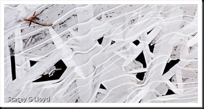
Blog image: Another shot from one of the recent cold mornings. Ice on the edge of a pond. Nice oblique movement and interesting pattern of dark and lights. Cropped to a 2:1 ratio format.

Thursday, January 6, 2011

Frosty Mornings

Blog_20110103_1

Frosty mornings can present you with a lot of photographic material. With the recent cold snap in the NW I have taken the opportunity to get out a couple of mornings for some frosty shoots - once in the yard and a couple times out in the local areal. Frosty leaves and flora are a classic and I just can’t get enough of them.

What am I looking for when shooting frosted leaves or plants?

  1. Nice color – rich subtle hues or bright  primaries.
  2. Simple compositional elements – oblique lines, circles, triangles, etc. without random crossing lines (like those caused by blades of grass). You might have to do a little finger pruning.
  3. Are the corners filled or balanced and symmetrical?
  4. Geometric pattern of color or just nice balance?
  5. Is there a single element that draws the eye within the apparent chaos?
  6. Nice frost.

Blog_20110101_1

Applying these to the blog images here is what we see in the first image:

  1. Rich brown tones.
  2. Diagonal composition formed by the leaves.
  3. The corners are symmetrical. If there were leaves in three corners and only one with grass it would feel unbalanced.
  4. Balanced with triangle in the corners.
  5. For me the leaf near the upper right attracted my eye.

For the second image (this will look nice as a large print):

  1. Beautiful mix of orange, yellow and green.
  2. No real strong compositional element but a strong repeated pattern. No rogue grass blades, twigs,etc.
  3. All corners are filled.
  4. The individual colors are evenly spread throughout the image maintaining balance. Look at each color and see the balance.
  5. For me the lighter green leaf cluster near the upper right caught my eye.

Was I thinking about all of this while shooting the images? Actually I was. It is pretty automatic now due to experience.

Saturday, January 1, 2011

Happy New Year! - Notan

Blog_20101227_1-2 

Thought I would get out a last minute Happy New Year to all of my readers out there. To start off the year I decided to write about notan.  Not nothing but notan.

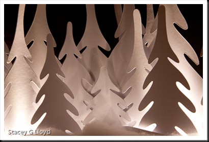
Notan is “a Japanese design concept involving the play and placement of light and dark next to each other in art…”. Or as it was put in a new book I was reading, Photographic Composition A Visual Guide, “The importance of negative space (ground) being seen as having shape and being harmonious with shapes in positive space (figure)”. The yin-yang symbol is a classic example. As in these two abstract blog images, neither the figure or ground (subject or background) are dominant and they balance each other.

Blog_20101227_1-4

These images were created from a Christmas decoration setting on our fireplace mantle. Having just read about notan these images came to mind as I stared at the decoration. The decoration is shown from a wider perspective below.

Blog_20101227_1-3

Another place to find notan material is in shadows. If the sun is shining where you live, go out and look for the interplay of dark and light on a sidewalk, see what you can find.