Wednesday, December 28, 2011

Coming Soon

Blog_1

As you may have noticed I have been away from the blog longer than usual. There are several reasons for this: the busyness of the holidays, a death in the family and work on a new combined blog/website.

The blog image was captured with an iPhone. While driving to a car shop, my wife and I accidently stumbled across a small area where there was a local “hoar” frost. It was absolutely stunning. A mile or two in either direction there as nothing. I didn’t have my main camera gear (shame on me) so I got out the iPhone and grabbed a couple of images. I added a bit of a white vignette to give it that out the window look . In addition I converted it to a selenium toned image (to add the cold blue hue).

Tuesday, December 13, 2011

Composition Notes – Balance

Blog_20111114_1-3

For the second in the series on composition, I thought I would touch on balance. One could write pages on this subject so I will only scratch the surface. Balance in some ways is one of the trickier aspects of composition. When is an image balanced? Should it be balanced? What factors come into determining visual balance? This blog only touches on the last question.

Don’t confuse symmetry with balance. Creating symmetry can be good in some images, but symmetry can often result in static or “boring” images. You can have balance without image symmetry.

Key to understanding balance is the fact that our mind implicitly gives weight to elements within an image. This weight is not just based on the elements size, but on it’s color, tonal value, local contrast, texture or other differences from the rest of the elements, etc.

Look at the opening blog entry versus the one below. Do you feel the difference? What is the difference?

Blog_20111114_1-4

It isn’t much, but the difference is the one red leaf along the top middle left edge of the image. First, red as a color carries a lot of weight – our eye is quickly drawn to red elements (notice in this image that the yellow leaves feel somehow secondary). Second, the red leaf helps balance the red leaves around the rest of the frame. In part this is done by completing a pattern. The red leaves almost form a circle (or possible a triangle) around the yellow ones.  When the one red leaf is gone it’s absence breaks the pattern and draws our mind’s eye. Our mind doesn’t like it when it can’t find a pattern that provides balance and goes off hunting. Completing the circle keeps our eye in the frame and on the subject.

Looking at the three primary yellow leaves in the image. Do you feel the balance? They are all different sizes but there is balance. One way to look at it is a teeter tauter (fulcrum). From the visual center formed by the three leaves note that the smaller leaf on the left is further from the center than the larger on the right. This gives balance around the “middle” leaf (just like we learned as children on the teeter tauter).

Looking back at the blog on “black holes” we can see that the black hole creates an imbalance because of its strong tonal weight. The same is true of white spots in an image.

I will leave you with one last image to think about. Look at the black and white image below. It has “black holes” all over the place. Why does it work? What gives the two asymmetric leaf clusters balance?

Hydrangea in Black and White

Sunday, December 4, 2011

More Flypaper Texture Overlays

Blog_20100304_2

Life is keeping me busy right now so before I continuing with the next installment on composition, I thought I would share some more images I have created lately using Flypaper Textures.

Blog_20110313_1

As you can see texture overlays work on a wide variety of subjects. Here are a couple quick observations:

  1. Subjects with subtle or non-cluttered backgrounds tend to work best.
  2. Try multiple textures on an image to see what works best.
  3. Try several of the Photoshop layer blending modes. I use multiply and soft light the most (so far).
  4. Vary the opacity of the blending modes.
  5. Apply multiple textures to a single image.
  6. Use masks to vary intensity of texture in areas of the image. Having minimal (to no) texture on the key focal points tends to work well.

Blog_20100621_1

Have fun!

Wednesday, November 23, 2011

Composition Notes – Black holes

Blog_20111114_1-2

While shooting the fallen leaves this past weekend, I decided to use them to illustrate some of the compositional elements I take into account while shooting. This is the first in a set of blog entries touching on composition. First i will look at black holes.

Blog_20111114_1

Take a look at the second image. Notice where your eye gets drawn – the black area in the middle upper left. That probably isn’t where you want the viewer to look. Compare this to the opening blog image where I simply placed a leaf in the hole – problem solved.

Ways of dealing with “black holes”

  1. Fill the hole as I did above.
  2. Shift the framing to eliminate the black hole.
  3. In post processing try to bring out detail in the hole by dodging it (increase local exposure).
  4. Clone something into the hole during post processing.
  5. Use the black holes or “negative” space as part of the composition – balance. I will touch on balance in a future blog.

Black holes are often a problem when shooting foliage and flowers, etc. This is especially true on sunny days where there are deep dark shadows. That is why cloudy days are often better for shooting these subjects (use a diffuser or look for shade on a sunny one). So instead of “dealing” with the black holes, you can avoid them altogether.

Tuesday, November 15, 2011

Leaf Recycling

Blog_20111114_1-4

Even though the leaves may all be on the ground, you can still have fun creating great images of fall color. Just look at the ground. I went out and did just that Sunday morning. One of the final images is shown above. I started the morning practicing some creative camera techniques. Below is a sequence of images that set the stage for that above. The sequence started with a simple shot of the leaves on the ground (more on that in the next blog).

Blog_20111114_1-8 

First I captured a “simple” off center 9 exposure rotational image. To do this you keep a point in the viewfinder (pick one of the focus markers in your camera’s viewfinder) set on a single point on the subject (the leaf) and rotate the camera slightly as you click off the exposures. With a Nikon camera you can setup it up for multiple exposures to be blended automatically in the camera; with other camera’s you may have to blend them in Photoshop.

 Blog_20111114_1-7

Next I captured a 9 exposure zoom image. Keeping the focal point on the leaf at the same point as I slowly zoomed and clicked off the exposures. Notice there was a slight camera rotation as well. I reduced the focal length to get more leaves into the image.

Blog_20111114_1-5 

Putting these two techniques together you can end up with an off center rotational zoom image like that below. Hold onto the zoom ring as you rotate the camera to do this most readily.

Blog_20111114_1-2

I then applied this same technique to the base of the tree from which all these leaves had fallen (the opening blog image). It appears the tree is drawing in all of the leaves and sucking them down into the tree’s base. This is what ultimately happens in the forest as the leaves decay and feed the tree, but not quite so dramatically. The tree is recycling…

Saturday, November 12, 2011

Fall Color and Textures

Blog_20111104_1-4

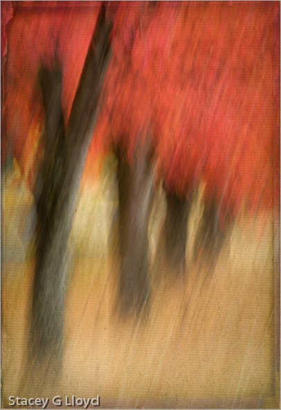
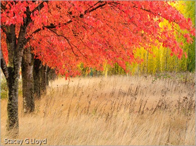
It is hard to believe that fall has come and almost gone. This past year has gone so quickly. I not only love the bright colors of fall, but all the various shades of brown the grasses and plant take on. As always, I try different techniques on any good subject I find. This row of maple trees in an abandoned business park is one example. The opening blog image was created from a swipe (1/4 sec) that then had two texture overlay layers added. Both textures are Flypaper textures. Shown below is the swipe without the added texture layers.

Blog_20111104_1

The third image is the scene shot straight at f22 for maximum depth of field.

Blog_20111104_1-3

The final image is a landscape format capture of the scene that brings in more of the green in the distance trees. Shooting both landscape and portrait orientations of a subject is always a good idea; that gives you more options for possible publication or stock image use. I find I like each of these images for different reasons. Which do you like best?

Blog_20111104_1-2

Saturday, October 29, 2011

Flypaper Textures

Blog_20100730_1-2

In the past couple of years, the use of “texture overlays” has become quite popular (see Flickr).  Personally they appeal to me because of the painterly quality added to an image. Up until now I have only used textures that I have captured. Typically I have grabbed the texture on location (a close-up of a building’s texture for overlay on other images of the building). However, I have seen some beautiful images from Tony Sweet, John Barclay and others that use prepackaged texture images from “Flypaper Textures”. They offer several differ sets of textures which can be purchased. The quality of these textures is excellent and multiple textures can be applied to an image to make it unique. I highly recommend them. 

Textures can be overlaid with an image using various tools, but the most common is simply using a layer stack in Photoshop as shown below. For the sunflower image I used two different Flypaper textures. First I added the “Antiquity Scroll” texture from the Flypaper Texture Box Two collection. I blended it with the primary image using the Color Burn mode at 46% opacity to get the look I wanted. Next I added a mask to that layer and removed most of the texture from the first sunflower. Secondly I added the “Muscatel” texture from that same collection. I blended this second texture using the Multiply mode at 100% opacity.  Again I added a mask  and removed most of the texture from the left most sunflower and some from the center flower. Third, I performed an overall curves adjustment to the stack; the image was a bit dark and low in contrast. Finally, I enhanced the contrast of the left most sunflowers center using selective application of a curves layer.

How do you know what textures to use or which blending mode to use? Basically you need to experiment. Try different textures, opacities, blending modes and masks. There are also several tutorial blog entries on the Flypaper Texture Blog.

PS Layer Stack

Saturday, October 22, 2011

First Articles Published

Blog_20111018_1

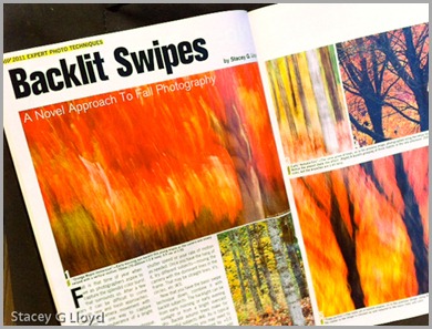
Excuse my shameful self promotion here, but it is exciting to get your first article(s) published in a national publication. In this case Shutterbug’s Special “Expert Photo Techniques”  (the cover is shown in the last blog image). The first two images are iPhone captures of the lead pages for each of the two articles. If you have been following my blog you know that both of these articles are based on work you would have seen here first.

Blog_20111018_2

In case I didn’t mention it before, these two articles were written several months apart but just happened to be put in the same issue by the editor. Both of them are “how to” articles on creating some of the images shown in my exhibit earlier this year.

If you want to pick up your own copy, you can generally find this special issue wherever Shutterbug magazine is sold. Enjoy.

Blog_20111022_3

Wednesday, October 12, 2011

Fort Point in HDR - Revisited

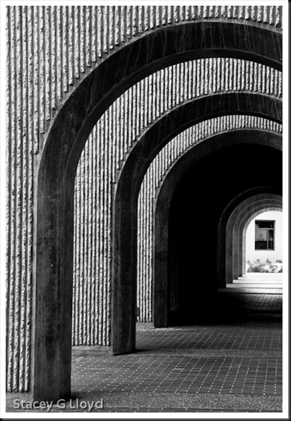
Blog_20111003_2 This past week I was able to return to Fort Point in San Francisco. Unfortunately, due to traffic I only had a 45 minute window in which to shoot before it closed. Here are a couple of images from that visit. It was a great place to photograph the first time and was again the second. If you can go there, I highly recommend it. It is the lighting that excites me when I am there; very dramatic with wonderful arches, lines and shadows everywhere. As before, I shot HDR sets to deal with the extreme light range.

Blog_20111003_1 One thing I decided after my first visit was that this place begs for people in the images. I made use of my camera’s timer to take some images where I ran out into the frame. In the image above, that is me in the window. I shot one medium exposure frame in addition to the HDR set where I stood on the steps by the window. I then blended myself into the HDR image using Photoshop layers and a mask. It looks like I am outside the window, but I am not.

Blog_20111003_3

All HDR images processed with HDR Efx Pro from Niksoftware. Additional processing was done in PS5 with other Nik Filters.

Friday, October 7, 2011

Texture Overlay

Blog_20110922_1-5

When I am out in the field shooting, I try to remember to capture close ups as well as the big picture; get that nitty gritty detail. These close-ups can come in handy later for creating what are known as texture overlays. The image here is a blend of two images taken on my recent outing in Colorado and Utah. The rock structure shown below was taken at Arches National Park at sunset.

Blog_20110922_1-2

The close-up texture was taken in the Colorado National Monument. It is shown below.

Blog_20110922_1-3

As I was reviewing the images I noticed the similarity in the contours. One thing I should mention about shooting the texture image: I try to be conscience of the composition formed by the lines or key elements in the texture (often using the rule of thirds). I try to apply the same vision to the composition as I would for any other image.  I find that my texture images often work well with my other images as a result (common eye).

The final image is created by blending the two originals together in Photoshop using a mask layer shaded to taste by using a pen tablet. See the screen capture below. As shown, a curve adjustment was used as well to get the desired contrast in the final image.

Layers

Sunday, October 2, 2011

More of Nature’s Spotlights

Blog_20110919_1

I thought I would share more images where nature created natural spotlights that highlighted key elements in the image. In creating strong images second only to composition is the quality of light. Again most of these are from my recent trip to Colorado and Utah. The image above is one of my favorites.

Blog_20110913_1

The image above would not be that strong without the natural spotlight on the side of the hill. It is that light that caught my attention. While the rock peaks of Rocky Mountain National Park were around me, it was this special light on the hill behind me that made it stand out. This is an example of why it is always good to be looking all around you when you are shooting; especially if the lighting is fairly dynamic.

Blog_20110922_1

The last rays of a sunset highlighted the tops of the rock structures captured above making them standout against the background.

Blog_20110922_1

As in the previous image, the last sun rays before sunset touched the top of this structure and highlighted the grass along the foreground.

Tuesday, September 27, 2011

Nature’s Spotlights

Blog_20110921_1

Lately I seem to be tuned into how nature spotlights elements of the landscape. This can happen on a cloudy day when beams of light shine through a hole in the clouds, at sunrise or sunset when the suns rays find their way through a gap in the mountains or when sun light bursts through a hole in the trees. Notice how these spotlights draw your eye to a specific feature.

Blog_20110716_1-2

I have included here a couple of examples from my recent trips to Washington, Colorado and Utah. When you are in the field shooting, make sure you take time to look all around you and notice how nature is highlighting the landscape. If you see light moving across the top of the mountains, watch and wait to see if it brings out a feature that will add to your composition. Often you have to be patient, but the reward is worth it.

Blog_20110913_1-4

Also note that nature provides different colors of spotlights come morning or evening.

Blog_20110913_1-5

Blog images:

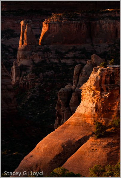
  1. Shot at sunrise at the Colorado National Monument. Light was selectively beaming onto different monuments as the sun broke the horizon.
  2. Here a ray of sunlight coming through the tree canopy formed a perfect spotlight on the base of this Sycamore tree early one morning at Maryhill State Park in Washington state.
  3. The last rays of aspen glow just hit this mountain top through a gap between other mountains at sunset – Rocky Mountain National Park in Colorado.
  4. Another hole in the clouds late in the afternoon created this spotlight on the mountain side. Again in Rocky Mountain National Park.

Thursday, September 8, 2011

HDR Saves Even a “Bad Day”

Blog_20110424_1-4

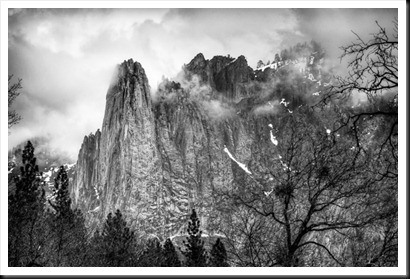
In going back over some images I captured in Yosemite a few months ago, I was once again reminded that even a “bad day” with good subject material can yield great images. When I was in Yosemite the light was flat, the valley seemed gray and the clouds were low. I never did see Half Dome. Below is what an unedited RAW image file from the HDR set looked like. Regardless I decided to shoot HDR exposure sets keeping B&W processing in mind.

Blog_20110424_1-6I just got around to processing some of the images and am quite happy with it. Others ones like that below came out quite nice as well.The power the photographer has with HDR photography and the latest image processing tools is impressive.

Yosemite NotchYou might be asking if HDR was necessary. The answer is yes and no. The light was such that I could capture images like the first one in one exposure (the one shown is an example). However, I choose HDR to get the most data I could in the shadows and highlights. This allowed me great deal of latitude in bringing out a lot of contrast and detail. 3 exposure was probably plenty, but I don’t get to Yosemite very often.

Blog Images: Both images were generated in Photomatix 4 from 5 exposure sets. They were then post processed using Nik’s SilverEfx Pro. Some additional adjustments were made in Lightroom3.0 and/or with Nik’s Viveza2.  The last image was shot with a 450mm focal length to grab the “V’ composition I saw in the distance.

Saturday, September 3, 2011

My Mother’s Passing

Blog_20110810_1

I learned today that my mother passed away. While tears were shed they were mostly tears of joy. She has had Alzheimer's for well over a decade and so the mother I knew has been gone for many years.  It was good to know she was finally no longer subject to that terrible disease and was now in a much better place. I am sure she is singing and humming the old hymns as she used to do around our home. I can still hear them.

Why I am writing about this here? One of my earliest memories of photography is of me photographing an Iris in my mother’s garden. She loved to garden and often had me “dig in” and help break up soil, transplant shrubs and pick the vegetables. I am sure it was here love of gardening that instilled in me a love for the natural beauty of God’s creation. She has been dearly missed.

Blog Image: Somehow this image seemed appropriate. A flower basking in a glorious diffused light. New and fresh, reborn. The image itself is a high key photograph of a Coneflower taken against a white background lit by window light and filled with a reflector.

Thursday, September 1, 2011

Analysis and Creativity

Blog_20110720_1

I once had a college professor state that “you must be able to analyze before you can create”. This was much to the chagrin of the young engineers who wanted to just design something new, not analyze an existing design. Applying this to art and photography it is essential if you want to grow as a photographer. You need to spend time viewing and analyzing artwork and photographic images to see why they work. Look at the use of color, the use of tone, the composition or placement of key elements, the shape of the frame, the quality and direction of the light, the implicit lines formed by the tonal transitions, etc. You can also ask yourself how does this image make you feel and why? Why did the artist/photographer use the perspective/lens he did? Take the time just to study one image. It can really be enlightening when you are analyzing well crafted images. In the end, this analysis prepares your mind and heart to creatively capture what your eyes and soul see.

Blog Image: Taken at Stanford University. 1.3sec at f22. Processed with Lightroom 3.0.

Friday, August 19, 2011

Simply Rocks - Analysis

Blog_20110718_1-6

You would think photographing rocks would be simple, but sometimes things are not as simple as they appear. On the shore of the Columbia River a few weeks back I decided to shoot some images of the beautiful river rock along the shore (in Maryhill State Park).  Here are a few of the decisions or things I had to take into consideration.

  1. Is the composition pleasing? Finding something that really works can take a bit of searching. Sometimes you do some rearranging to get what you what, but doing that can be risky. The image can easily look too contrived or just not natural.
  2. Lighting? In this case it was early morning sunlight. I did try shading (my body)  and using a diffuser to modify the lighting. In the end I chose the low angle sunlight. I used a polarizer and varied the amount of polarization to get the look I wanted.
  3. I varied the shutter speed. There were small rippling waves coming in and that kept the rocks wet. Did I want to see motion or not in the image? I liked the images without water motion– 1/30sec.
  4. Which lens would be best? My 105mm macro or my 24-70mm zoom? I went with the macro.
  5. What aperture? While the rock surface was flat, I did need to make sure the closest and furthest rocks would be sharp. With a 105mm macro this was critical. I found f11 was sufficient.

During the post processing there was a whole different set of questions and decisions to be made. How much contrast? How much color saturation? Any white balance adjustments to be done? Cropping? Touch up? Vignette?

Blog_20110718_1-3

So that is why these “simply rocks” images are more than they appear.

Sunday, August 14, 2011

Return to the Lavender

Blog_20110731_1-6

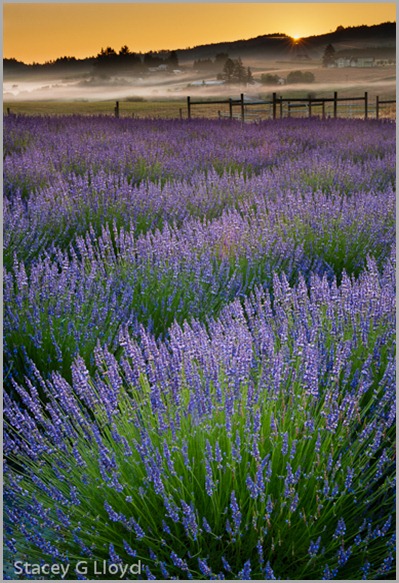
Another year has passed and the lavender returned. Due to other obligations in my life, I was not able to get out and capture much of the lavender this year. A couple of weekends ago, I got the chance to capture a field that was still in reasonable condition. It was at Willakenzie Lavender Farm in Yamhill Oregon. I got  out bright and early so I could catch the sunrise on the lavender. As I drove to my destination it was hard to resist all the possible images I saw along the way. There was nice ground fog hanging here and there along the beautiful valley, but I was determined to catch first light on the lavender. Here are a couple images from that morning.

Blog_20110731_1-9 


Blog_20110731_1-4

Blog images:

  1. This is an HDR image captured at sunrise. I didn’t quite get the sunburst I hoped for. The image was processed with Nik’s HDR Efx Pro with some additional processing in Lightroom.
  2. The second image taken shortly after sunrise was a “shoot through” were I used a long lens (70-200mm zoom at 190mm) to shoot through some lavender and focus on one lavender stem. Shooting flowers with a long lens is  not typically the first thing that comes to mind, but it can result in nice images. f6.3 at 1/160 sec.
  3. The last image captures the sunrise light just brushing the tops of the lavender. 70mm, f22, 0.5sec.

Thursday, August 4, 2011

Beyond Sprinklers

Blog_20110720_1

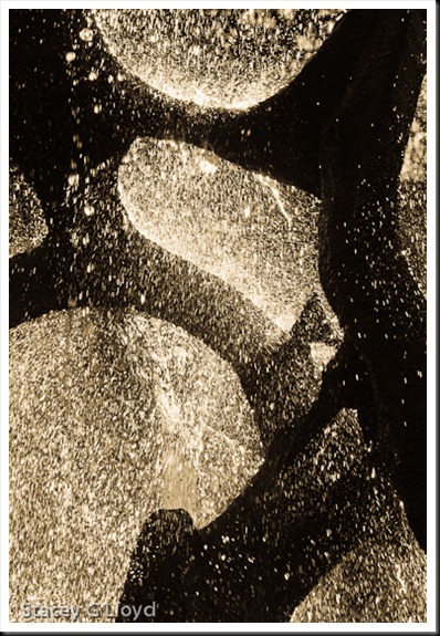
A couple of  blogs back I  wrote about shooting backlit flowers early one morning when the sprinklers were on. Then this past month I was roaming around the beautiful Stanford University campus late in the evening looking for images to capture. As I walked around the fountain sculpture shown below (the White Memorial Fountain created by Aristides "Aris" Demetrios) the sun moved back behind it creating a dazzling light show.

Blog_20110720_1-11

I couldn’t help but think of those flowers. Applying what I had learned from shooting them I was prepared to capture this set of images. This is why it is important to practice (I know you probably hate that word) your photographic skills at home and “along the way”. It prepares you for the future when you are at that far away photographic destination.

Blog_20110720_1-7

Besides capturing images from the side and taking advantage of the dark background, I also got down low and took advantage of the blue sky. I under exposed a bit to get the deep twilight sky look shown below.

Blog_20110720_1-9

The last image is one I call “The Mermaid’s Tale”.

Blog_20110720_1-12

Of all the image sets I shot at Stanford, these were the images that got me the most excited and made the creative juices flow. I am glad I was prepared.

Blog Image Notes: As with the flowers I generally had to adjust the EV to –1.- to –2.0 to handle the back light. I also shot with a range of shutter speeds to vary the shape of the falling water. The first image was at 1/80 sec and the last was at 1/800 sec. All images were processed using Lightroom 3 for tonality, etc.. The first two images used the Antique Light preset in Lightroom while the last two images kept the natural color.

After writing this blog I found this recent article about the fountain - http://news.stanford.edu/news/2011/june/claw-makeover-update-061011.html

All images of the sculpture have been used with the permission of the artist.